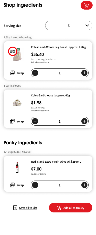
What’s for dinner
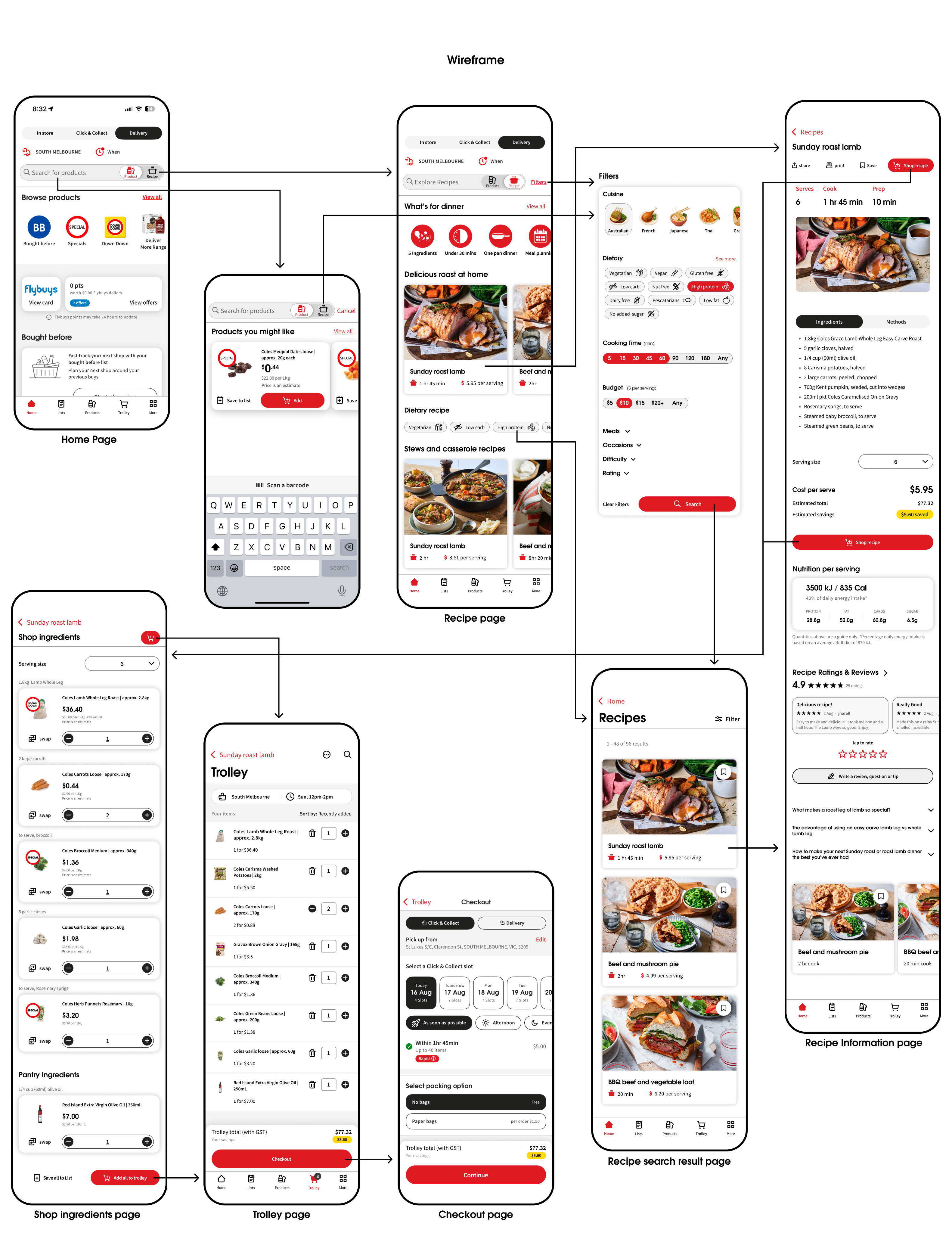
Redesign case study, Coles app features
Overview
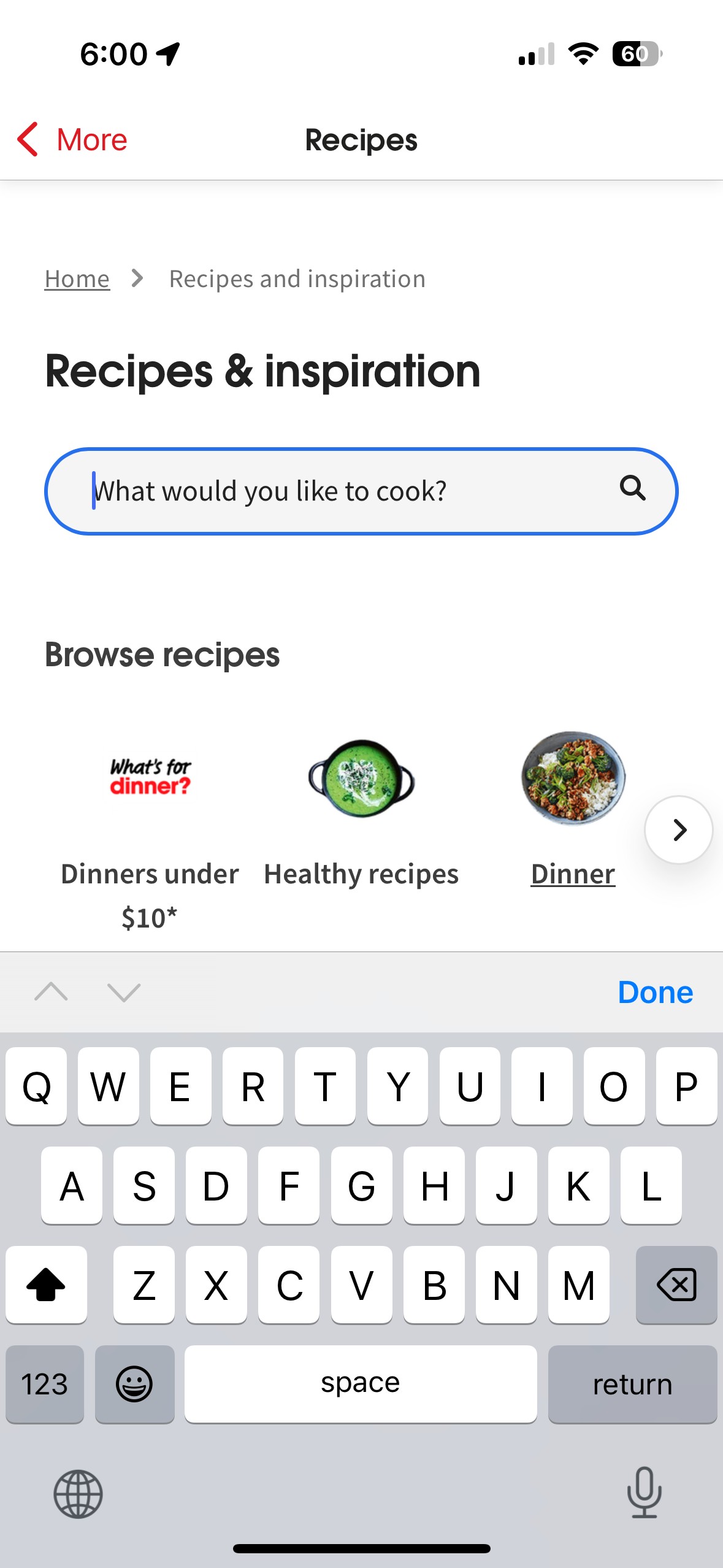
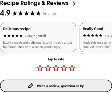
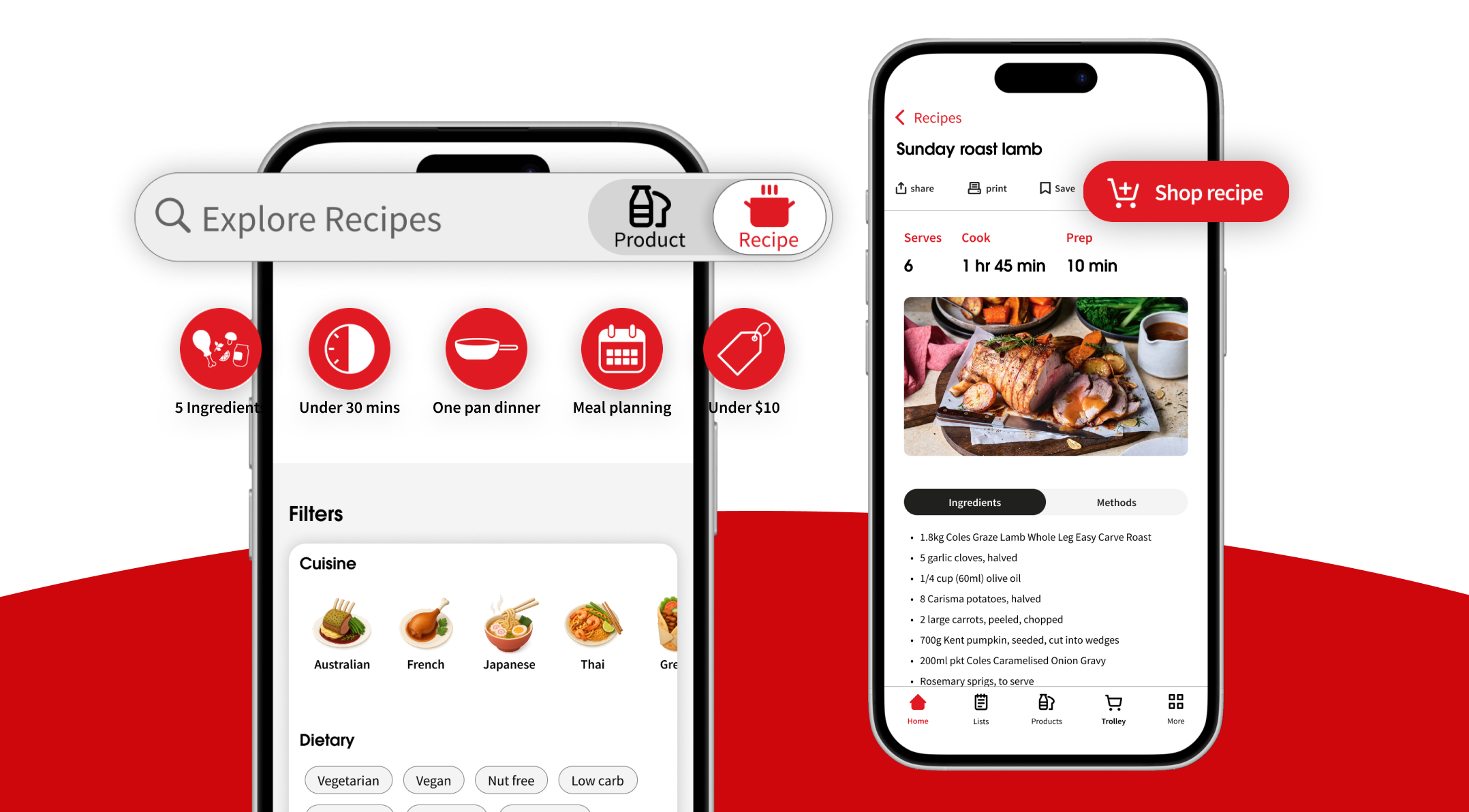
The question I simply ask myself every single day is “What should I eat?” It’s a question many of us share, and it’s the same idea behind Coles’ What’s for dinner campaign. What I’ve learned is that when people think about food, they don’t start with ingredients. They start with the dish, the craving, the flavour, the idea of the meal. Only after that do we think about what we need to buy. But in the current Coles app, recipes and groceries feel like two separate experiences. You’re expected to shop by ingredient first, even though our minds naturally work the other way around. This redesign focus on bringing those two worlds together. My goal was to redesign the experience to feel more intuitive, personalised, and seamless navigation across cooking and shopping. By building the journey around how people actually decide what to eat, starting from the dish, not the ingredient, and guiding them all the way through planning, shopping, and cooking in one smooth flow.
Problem
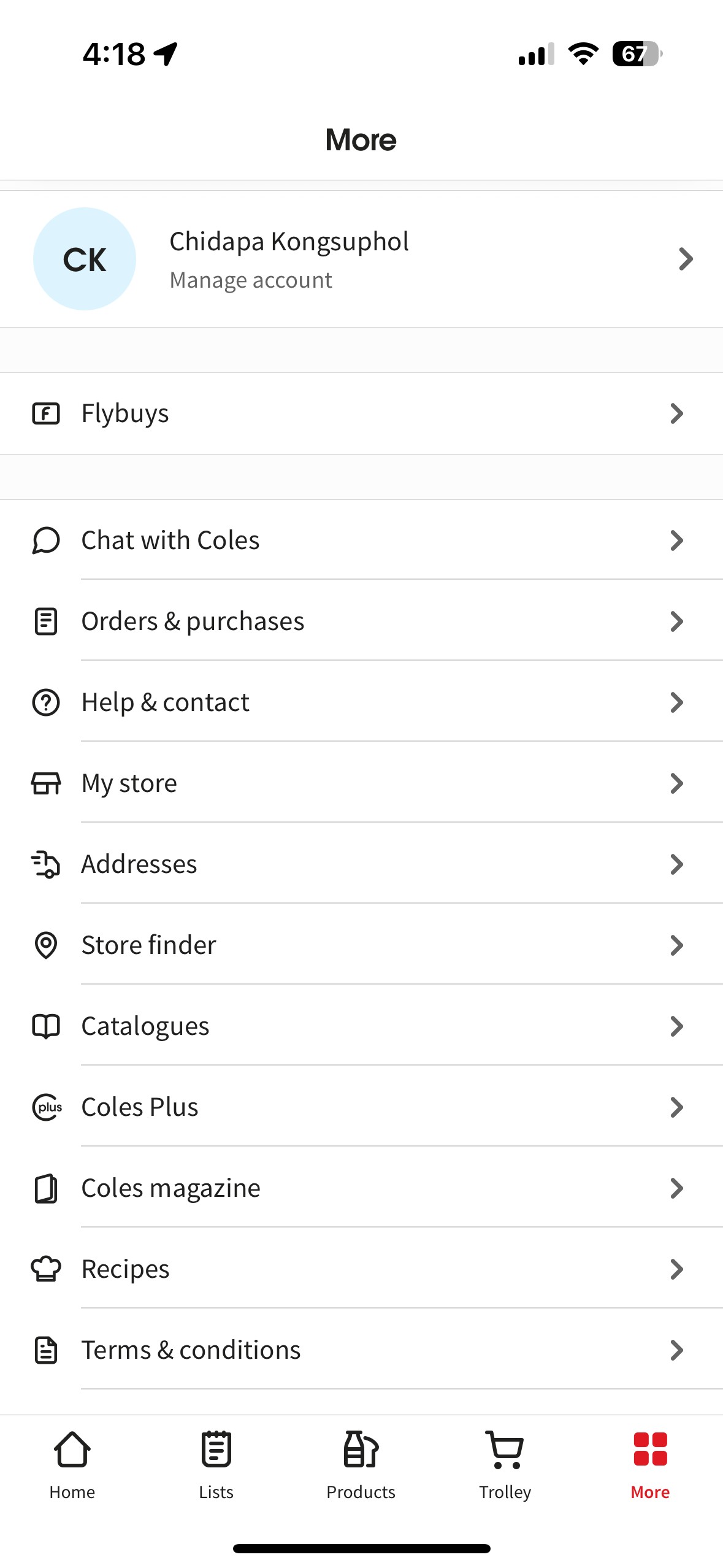
Through using the Coles app myself and reviewing user feedback, I found that the core issues weren’t about features missing, but about the features that already exist not being easy to find or easy to use.